
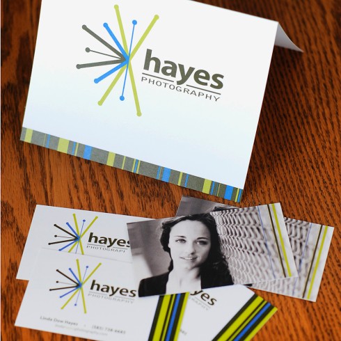
Back in 2008, when I started Hayes Photography, I realized I needed an identity. I came up with a name, but didn't know the slightest thing about designing a logo. I hired Erin Perrotta of Perrotta Creative to do that work for me. I was new to the business and didn't really know what went into this process but I had faith in Erin and she didn't disappoint. Her design was just what I asked for; fresh, simple and unique. I was very happy with the results.

In the Fall of 2012, I began to look more deeply into my logo design and branding and realized that I needed to make some changes. I'd grown as an artist and Hayes Photography had evolved as well. I wanted colors, styles and designs that fit into who I and my business are now. I sought the help of Carrie Colangelo of Studio-CAP, a graphic and web design firm (http://www.studio-cap.com). Carrie took a lot of time and effort finding out about my business, me and the message I wanted to convey. The results were just what I had hope for, bold, unique and colorful. This was just one more step in creating a strong, recognizable brand for Hayes Photography and my hope is that the public will see that as well.
Leave a comment
3 Comments
Apr 11, 2013, 6:00:18 PM
Benita Sundquist - Linda, I love it! The colors are great. Not too loud, not too little. just right. I also like the simplicity. It is effective without being busy. Some websites are so busy that it makes it difficult to navigate through. Very nice Linda..... as usual!
Apr 10, 2013, 5:31:56 PM
Sue - Love it Linda!!
Apr 10, 2013, 4:37:39 PM
Robin - I love your logo and everything you are doing with the branding! You rock Linda! I especially love the first image that appears at the header of the girl at some sort of fair? You inspire me!!!
PS-what blog site is this made with?